CSS Issues
The default gallery design isn't flawless and I'm not a web designer. On this page you will find most annoying design issues. If you know the solution, please let me know.
Content area not focused by default
There are three <div> areas on the page - the top navigation bar (class div.navigation), the footer (class div.footer) and the content area (class div.master_content). Earlier the two bars were fixed position layered above the rest of the page. Empty spaces were added on the top and on the bottom of the page to ensure all content is displayed within those two bars. User was able to scroll the content just by pressing the Space key in browser.
By introducing scrolling to parent items (i.e. when you jumped one or more levels up using the navigation bar, parent item was displayed), part of the content was hidden under the navigation bar. This is a designed behaviour of <a name> links. I had to make the content area fully visible to make the jumps work as expected.
I tried several workarounds like focusing the div using JavaScript on page load but it didn't work reliably. All these solutions are dirty and I want to avoid them as much as possible.
Padded text not wrapped correctly
Text in the album list item box is positioned relatively (left: 10.3em) from the left edge depending on thumbnail width (portrait, landscape, square). It has the correct width of the box, but it's shifted from the left. Adding padding from the right won't help in total box width and only breaks floating boxes structure.
Workaround: manually add line breaks.

Image name not centered properly
Every item/thumbnail in the index list is a <a href> box with picture and text inside, set as floating. As long as it is an inline element and not block element, positioning inside is made even harder. Similar to the album item box, all texts are positioned relatively from the left. Center is an unknown formatting in this case.

Content jumping on page load in Firefox
Content in the middle <div> "jumps" up right after the browser has finished page loading. It feels like to be part of the rendering process, just not hidden enough before page is finally drawn. Jumping appears only if the <div> element has the overflow: auto; property set.
Affected versions known to us are Firefox 3.0.10 - 3.5 series. Firefox 3.6 releases seem to have this issue fixed.
Image Processing Issues
Squared thumbnail crop issues
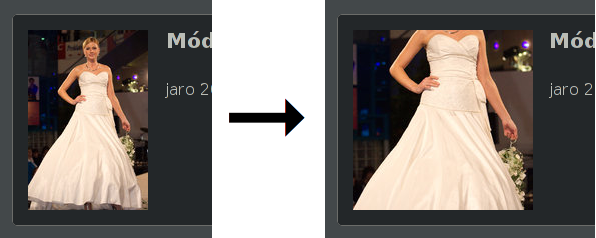
By introducing squared thumbnails which are usually processed from original portrait or landscape-aspect images, a new phenomenon has arisen. The current "simple" algorithm just takes center square area from the image, cropping the rest out. This works quite fine for nature shots but fails with people and animals. Have a look at the following illustration:

It's clear that everything placed topmost and bottommost on the original image is missing. In this case we omitted a head of the lady and that's certainly not nice.
With the "simple" algorithm it's not possible to individually choose crop area for the particular image. Some tweaking may occur in the future so that we crop portrait images from the top. But still this approach is not suitable for every image.
Therefore we're searching for an intelligent algorithm being able to determine image weight centre, able to mark the most significant object of interest. Widely used face recognition suites don't work for anything other than faces. It would be great e.g. to be able to target a mountain range with top peak placed near the image corner. Or a lake on the side of the image. If you know of anything suitable for our needs, please let us know.
 Cataract Gallery Generator